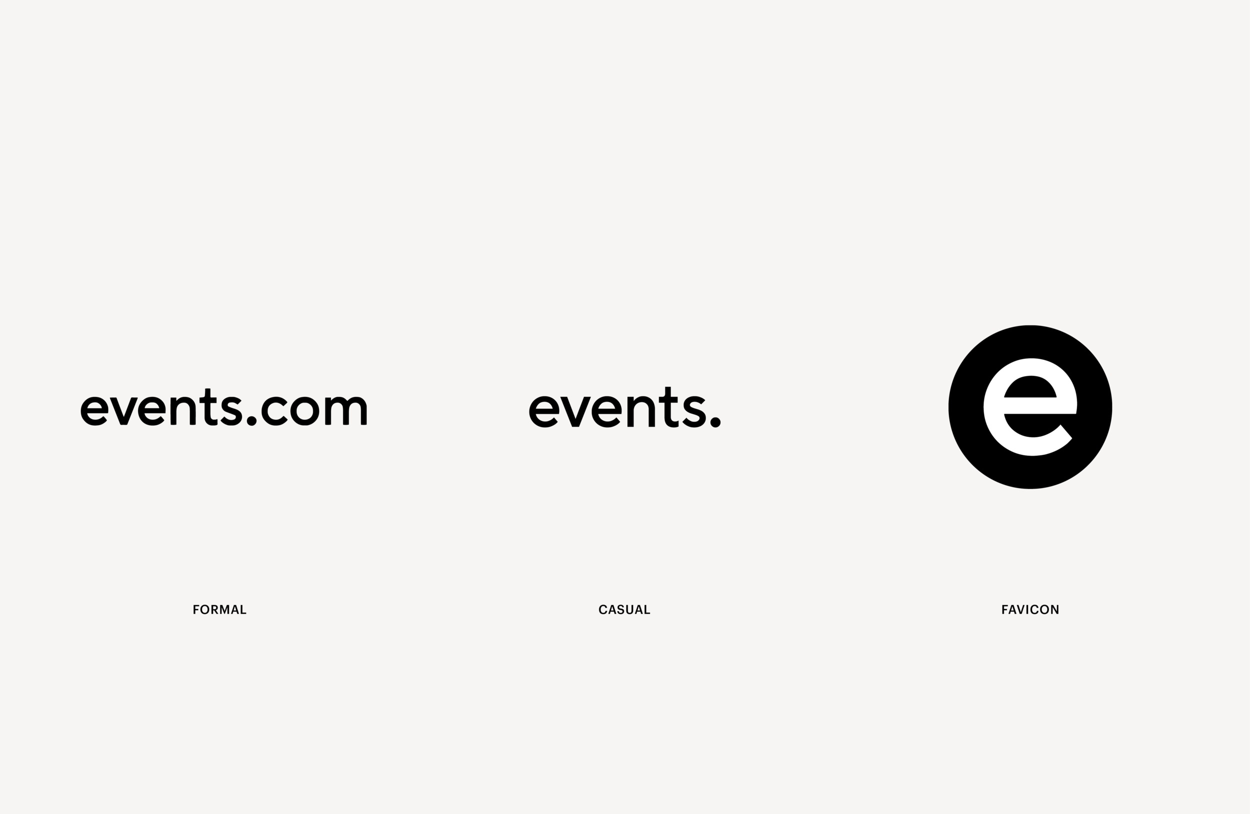
Events.com
Events.com
Event Organization
Verbal & Brand Case Study
Senior Designer
Brief
Our ultimate priority is to help the event attendees and organiser experience the things they love. We want to ensure the smoothest, most intuitive route to make this happen. The world of events is a dynamic place, where new and exciting experiences are only limited by human imagination. Our goal is to always push the boundaries, especially when it comes to experience, technology, and innovation.
Idea
We are a service that prides itself in helping people to get the basics right. Only when the foundation is strong, do we go further. We are an indispensable utility that helps keep events organized, safe, and seamlessly delivering on their core promise. While so much of what we provide is smart technology, at its foundation we serve passionate humans and their needs. Our brand is centered around helping people. Without them we are nothing.

Belong to the community and the experience on this planet.
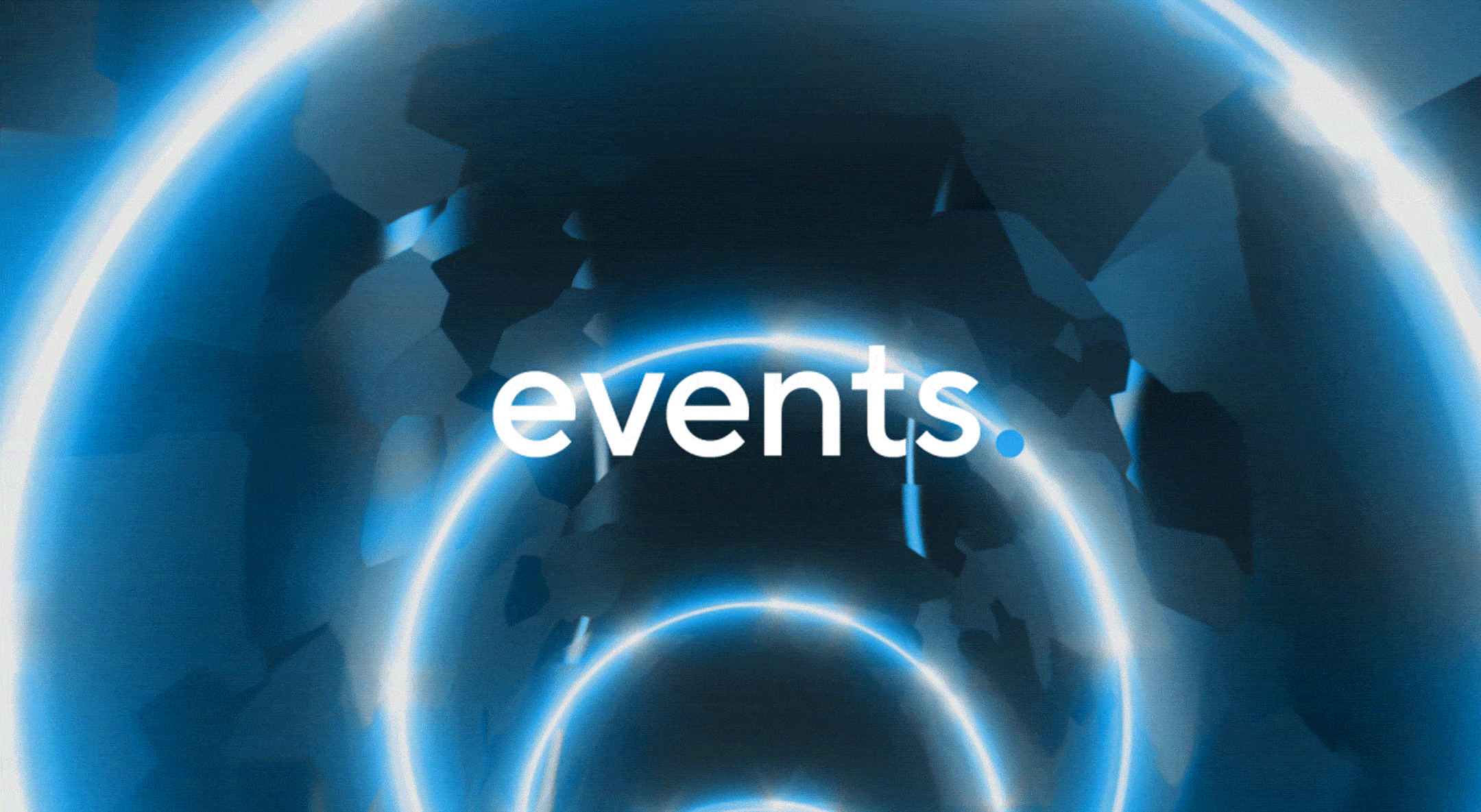
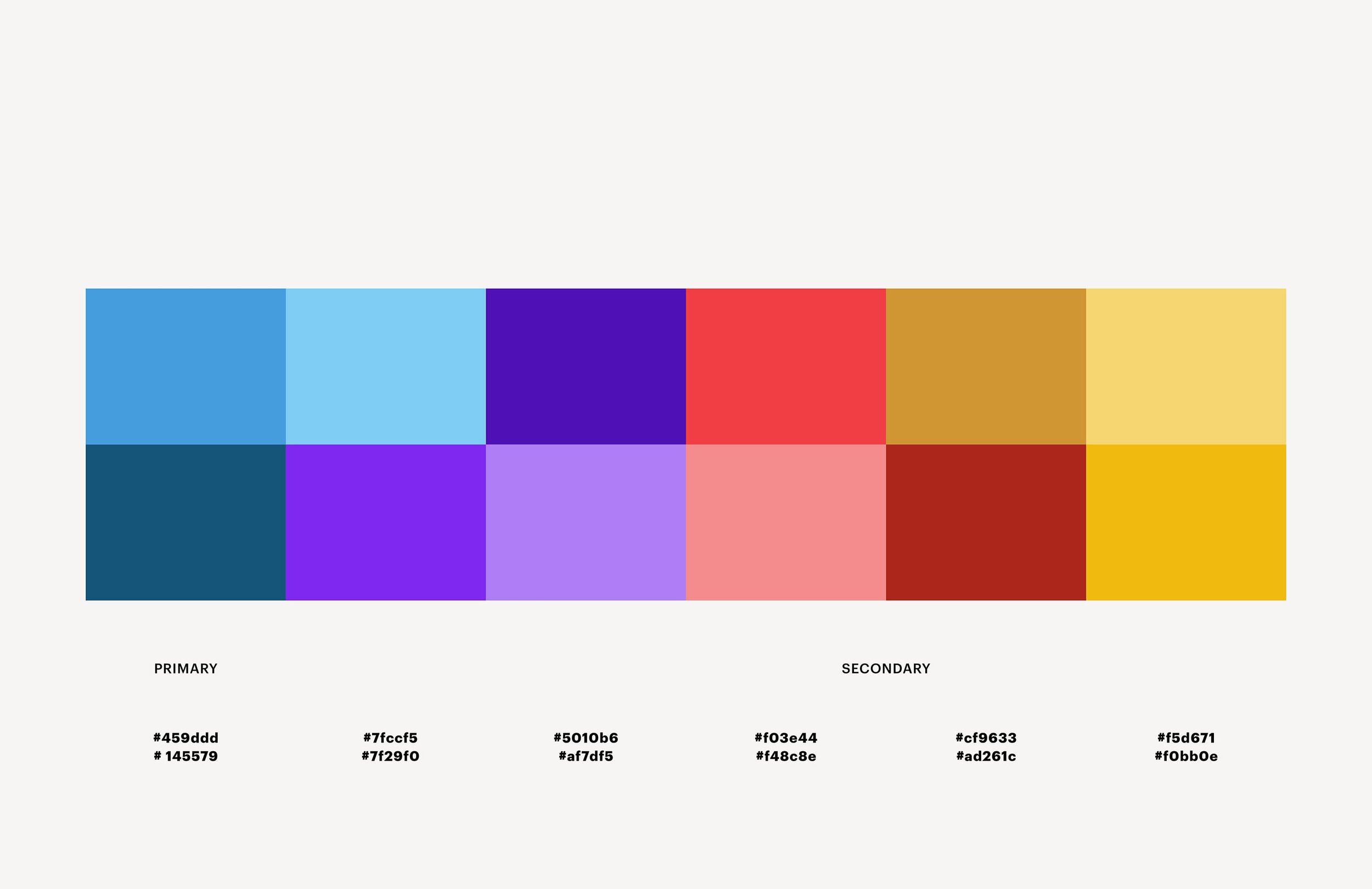
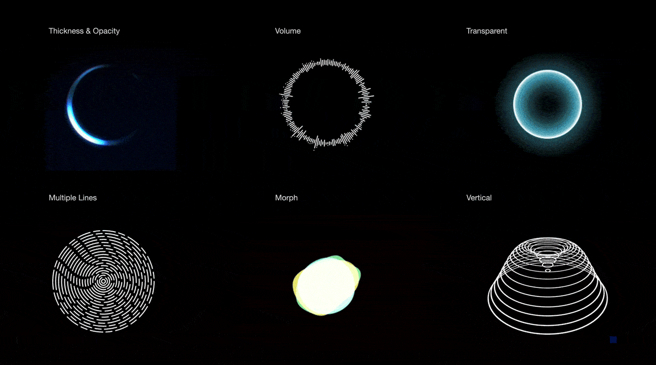
Visual Systems
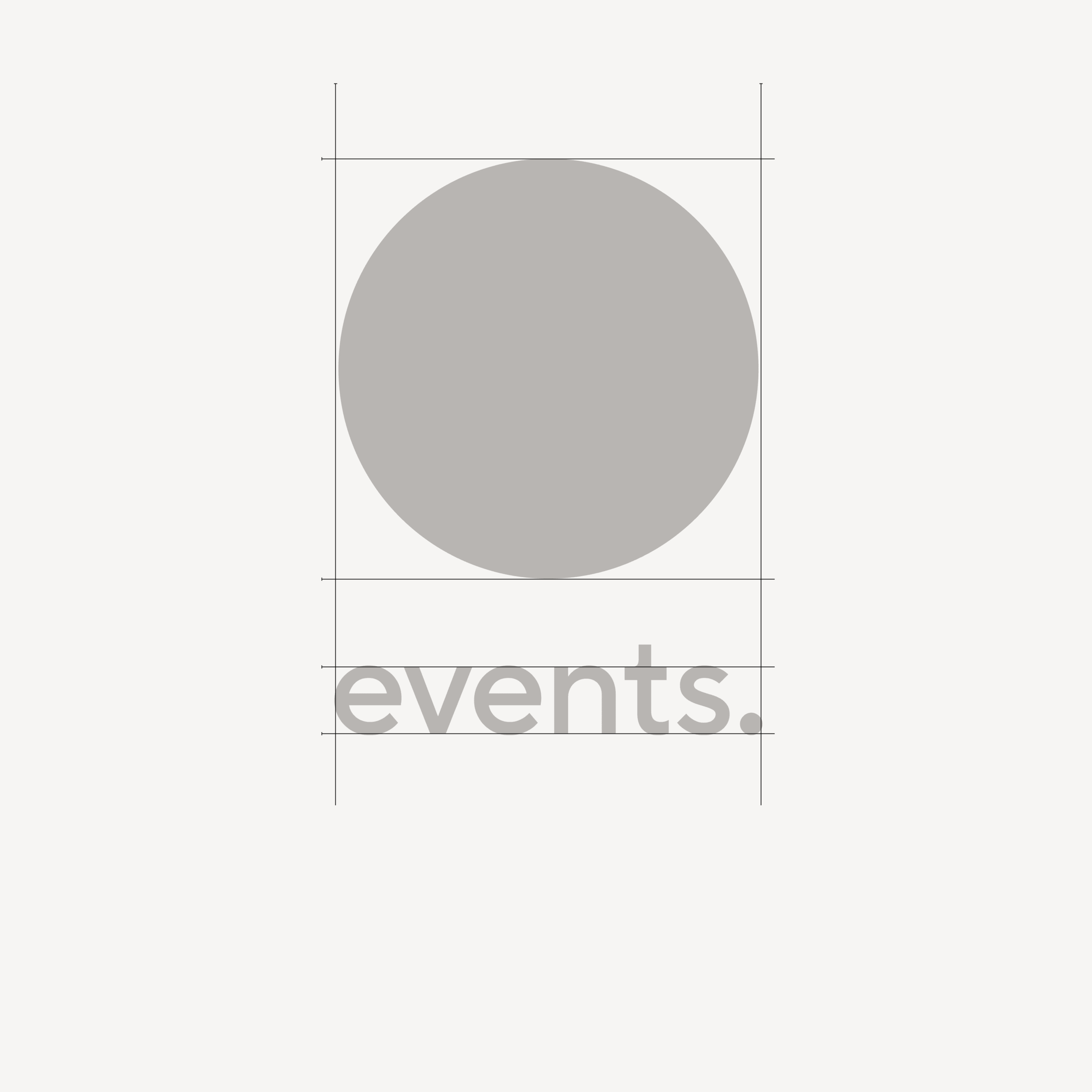
Considering space, direction, and colour on a static level, we can produce a high-spec dimensional animation. The meaning behind the circle is emphasized by creating an organic story, using relevant elements to take you on a journey.


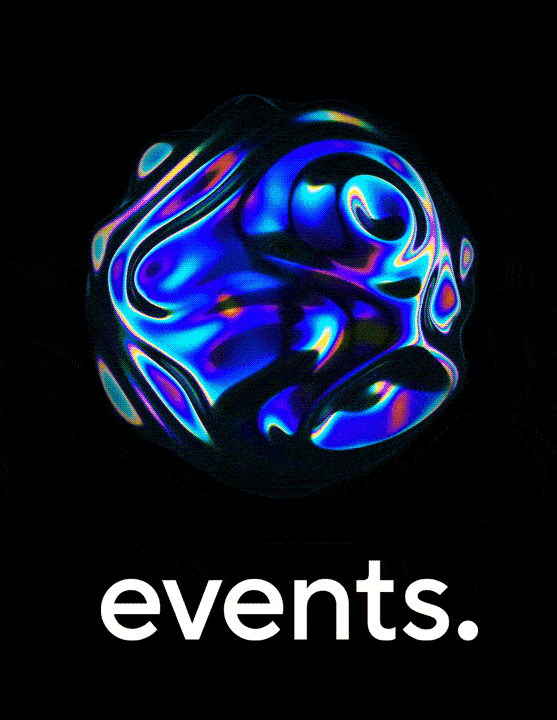
Position
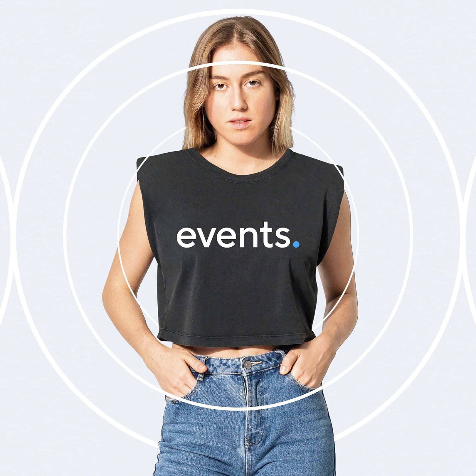
A complete change in energy and style were needed to attract a younger audience. This meant understanding the current customer persona. The person who never misses an event, a festival goer, etc; and ask questions on how Events.com wants to be perceived in the current fast-changing market. With the connection of treatment with shapes and forms based on the circle, we can see how this brand's legacy can start a new conversation with its younger audience.