Be.
The Be. Organization
Non-profit Organization - Education
Brand Identity - Website - Print Design
Art Direction, Designer
Brief
The Be. Org have been working in the Baltimore area for four years and are close to celebrating their 5th year anniversary. As they continue to grow; they will need to have a new logo and brand identity that their clients and partners can easily recognise.
Results
The main project goal is creating a logo & brand identity that will display the true essence of The Be. Org. The logomark needs to be concrete in its form and colour choice but also change its language to attract and retain new people in the organization.
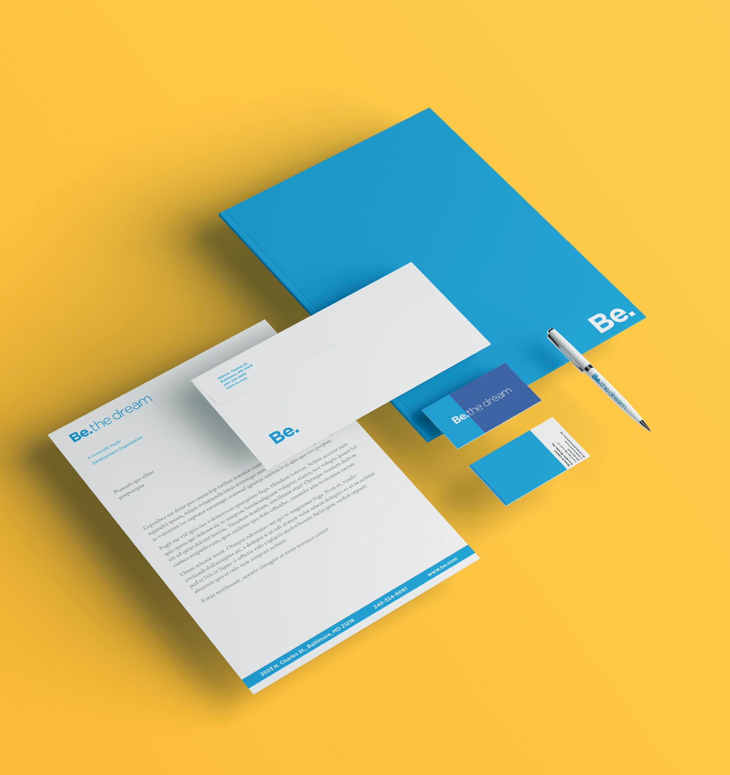

Typography
The previous logomark had many different typefaces & styles incorporated in the form. With the Gotham typeface, the geometric properties give the logo a delicate balance, as well as several techniques that can be useful for web and physical content.


Colour
The primary colours needed a revamp. With research, I was able to create a set number of colours that mimicked the last primary and secondary colours that express the positive the Be. the organisation provides to its clients.


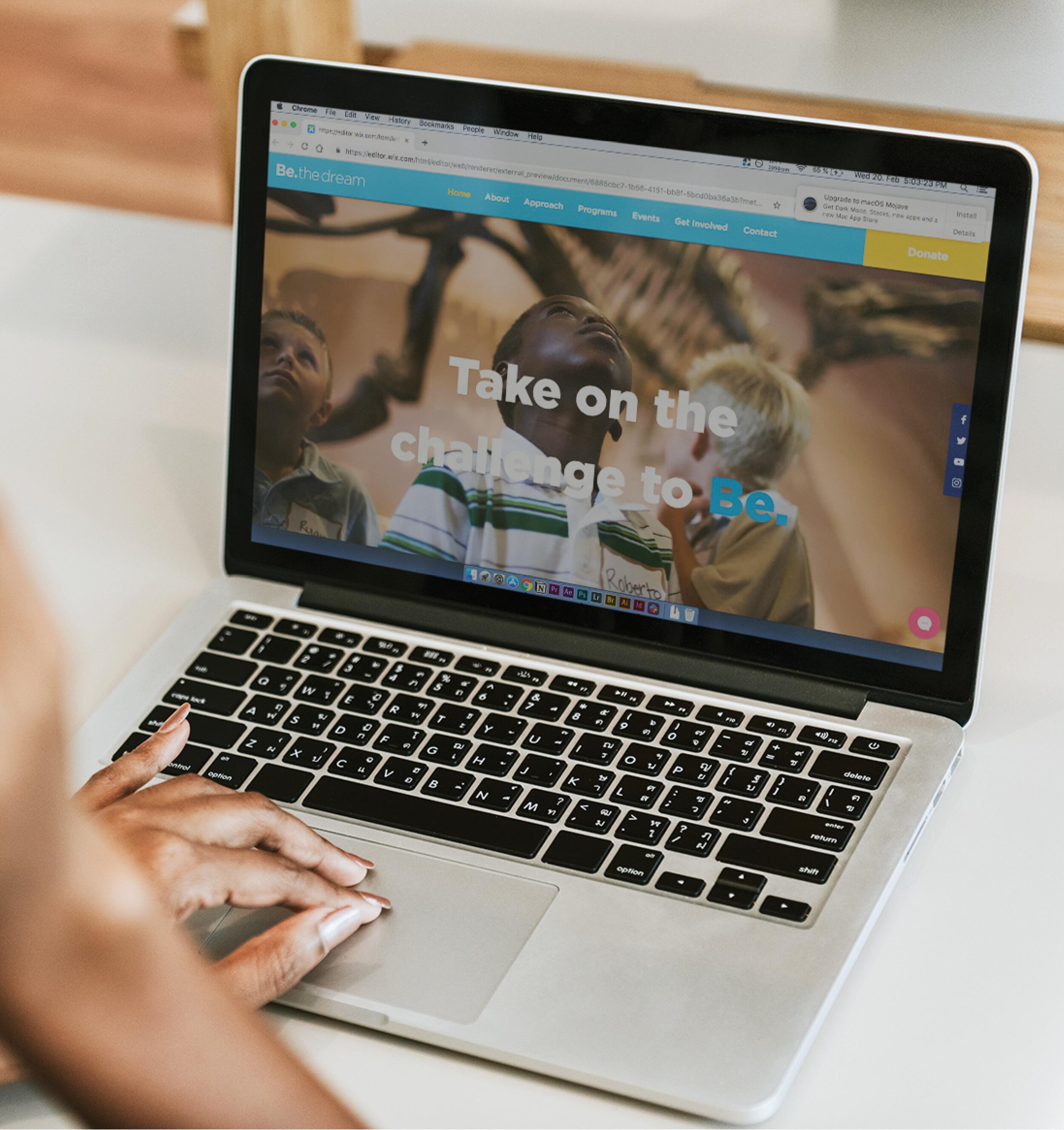
Web Design & Events
I designed and created a fresh website so users can access current information or donate to the organisation, significantly improving user experience. Halfway through the website redesign, I was invited to their ‘Sneaker Ball’ event. They celebrated their 5th year anniversary and unveiled their new brand identity. It was fantastic being a part of their brand redesign journey.


Results
Removing the clutter and simplifying the logomark made the form recognisable to their current customers. I adjusted their tagline to encourage a stronger ‘call to action’ towards new customers and donors.