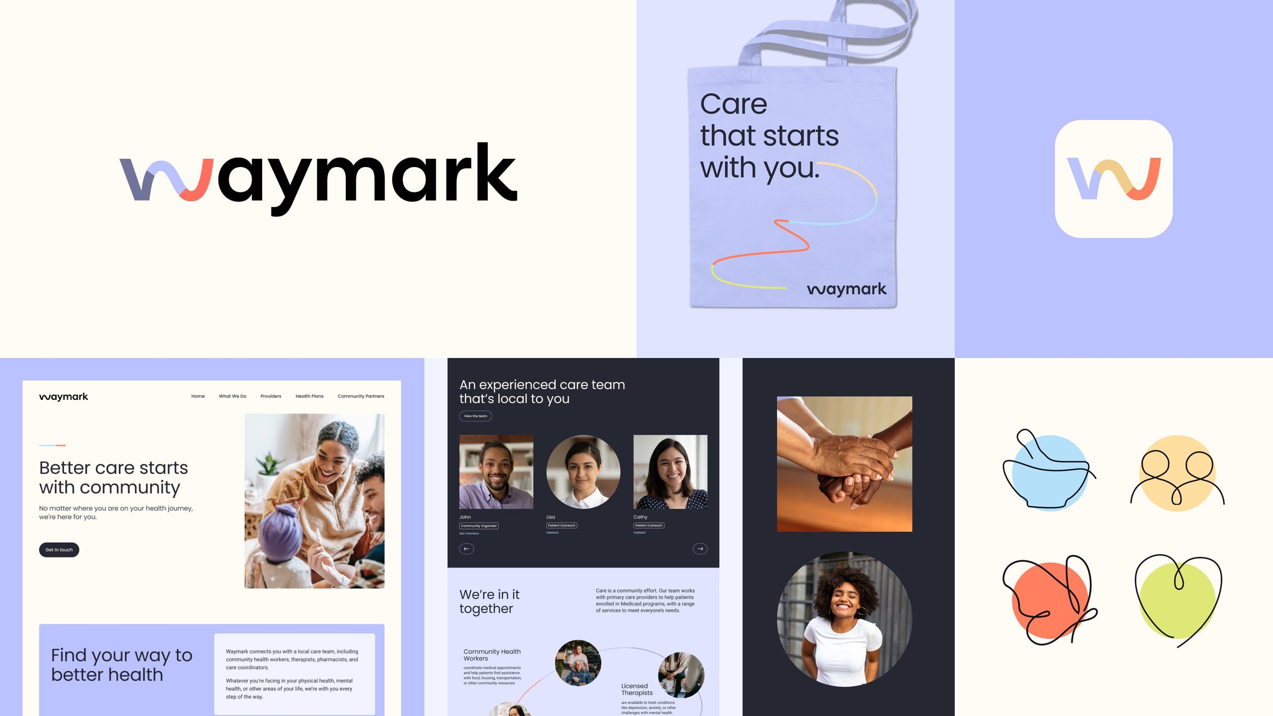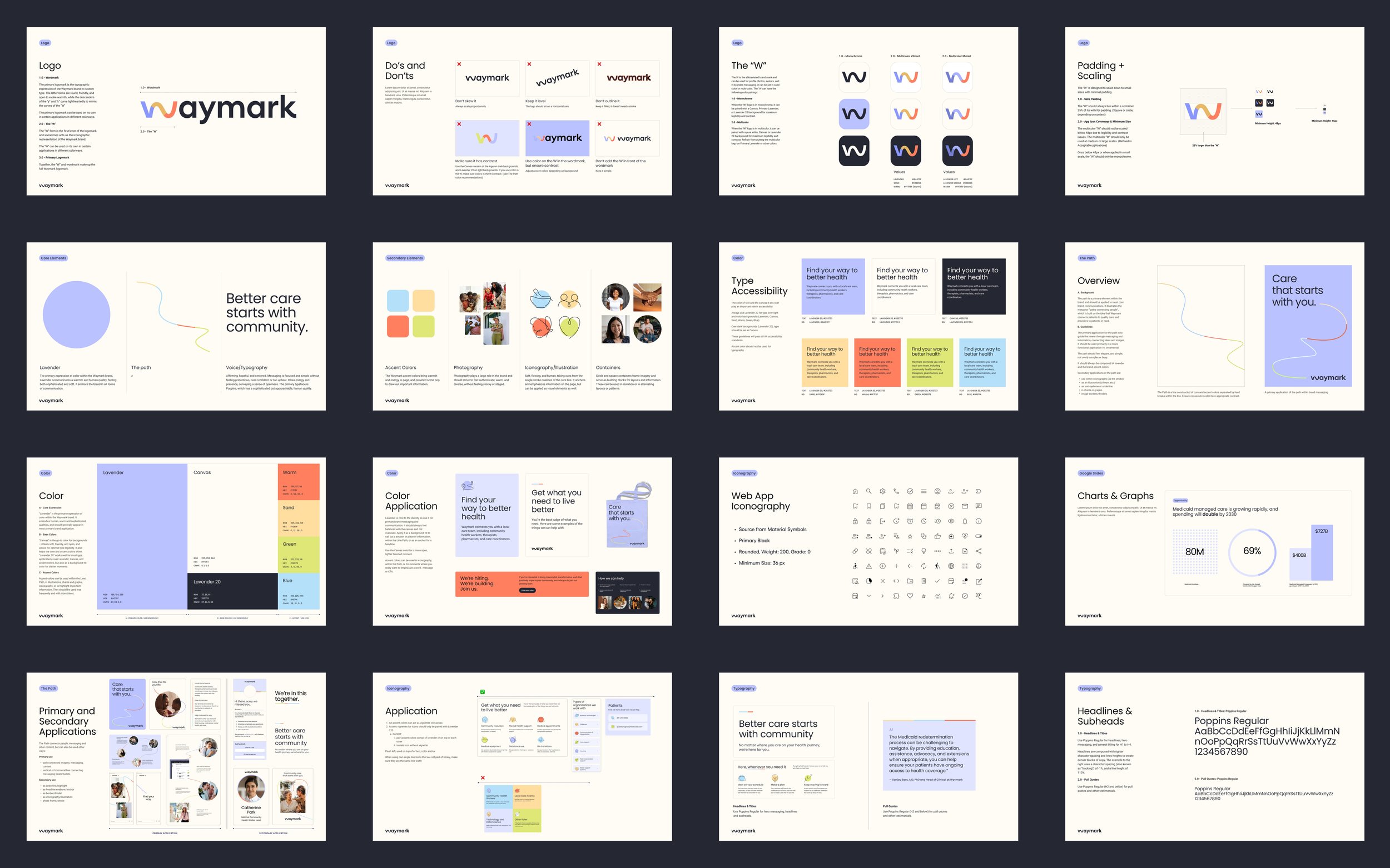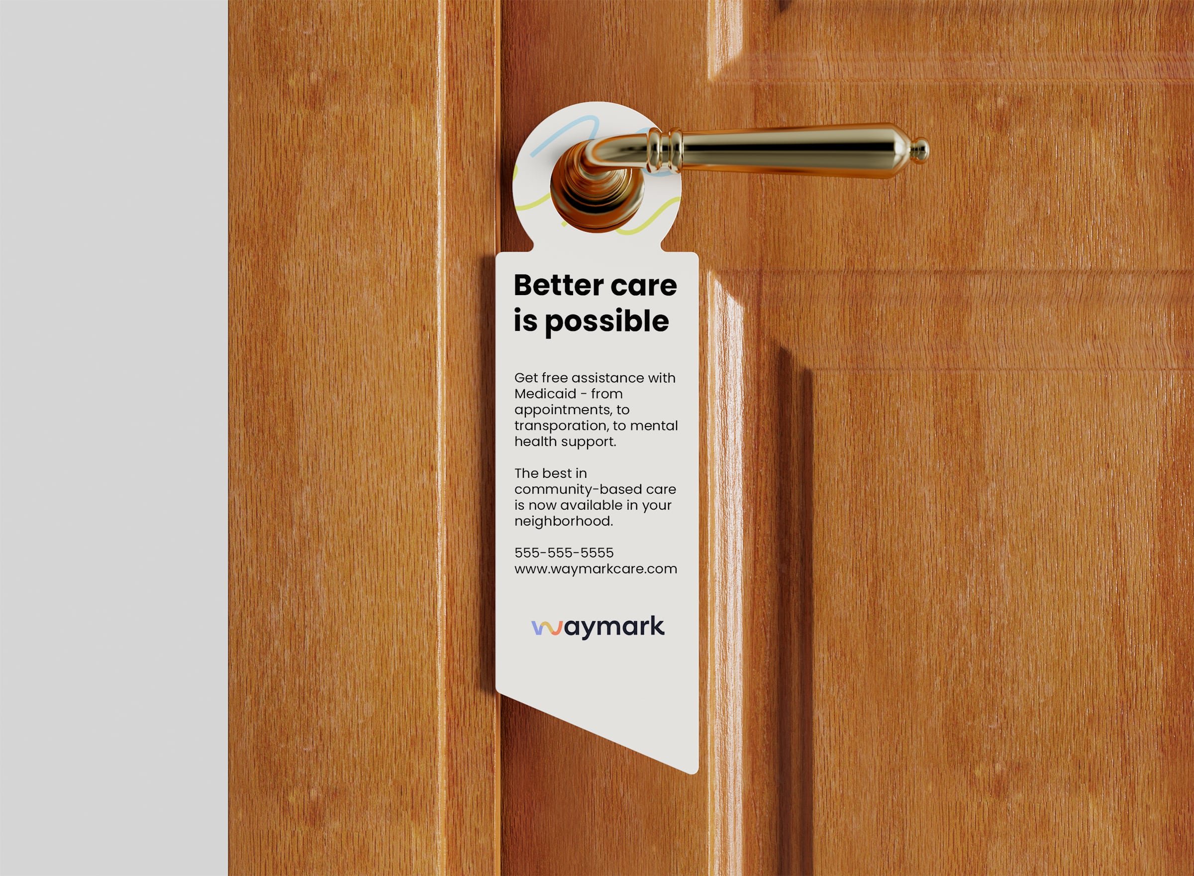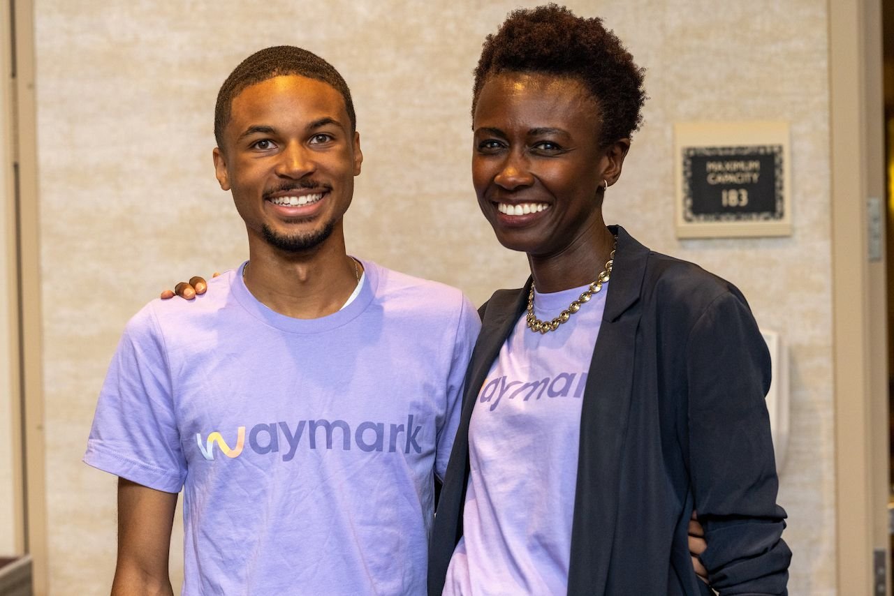
Embracing the new path to health in the community.
Waymark
Waymark
Health Care Communications
Graphic Design
Brief
Waymark, a health-based company, aimed to revamp its branding by incorporating vitality and purpose-driven visuals. The company works with Medicaid populations and their caregivers, using evidence-based research and technology to offer efficient community-based care models. The goal is to establish the brand as trustworthy, warm, grounded, and passionate by focusing on identifying and representing communities that could benefit from Waymark's services.
Idea
While researching Medicaid, I found that certain demographics, such as people of color and those with disabilities, were not receiving necessary treatments. I propose that Waymark should make it easier for people needing Medicaid to access services, creating a more accessible way for individuals to receive care.
Process
During the creative process, hand-drawn sketches were used to explore the cause-and-effect relationship in creating the ideal reflection. I also considered how to design a fluid shape "W" within the logo mark. I experimented with different shapes and forms from the beginning until the end, in order to achieve the perfect reflection and "W". Later, I created various digital edits based on feedback from the client and our internal team.
Output
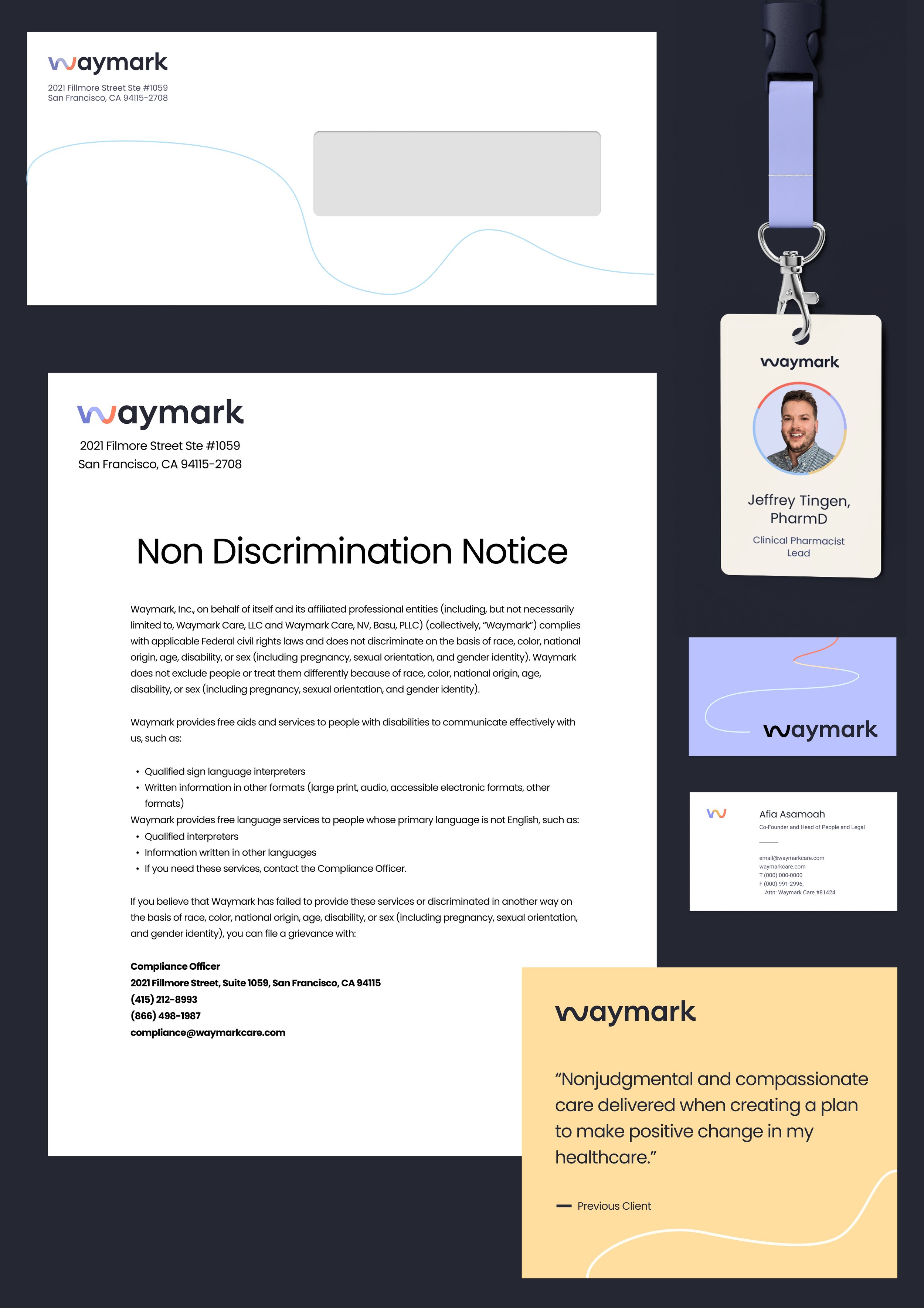
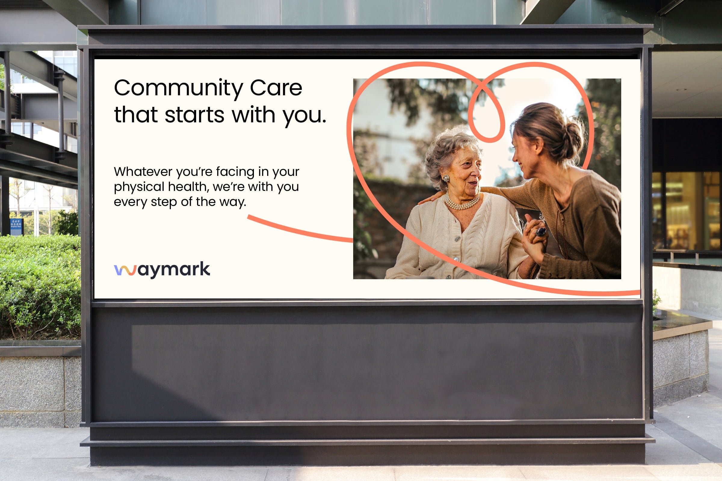
Together with other creatives on the project, we created a well-balanced logo that perfectly encapsulates the brand's essence while effectively conveying its message to those seeking Medicaid and a company that is dedicated to the community.

