The Be. Org reveals a new brand identity for local recognition and growth.
Be.
The Be. Organization
Non-profit Organization - Education
Brand Identity - Website - Print Design
Art Direction, Designer
Brief
The Be. Org have been working in the Baltimore area for four years and are close to celebrating their 5th year anniversary. As they continue to grow; they will need to have a new logo and brand identity that their clients and partners can easily recognise.
Results
We aim to create a logo and brand identity that truly represents The Be. Org. The logo should have a consistent form and color scheme while being adaptable to attract and maintain new members. The previous logo had various typefaces and styles incorporated into its design. By using the Gotham typeface, we can achieve a balanced and geometric logo that is versatile for both web and physical content.
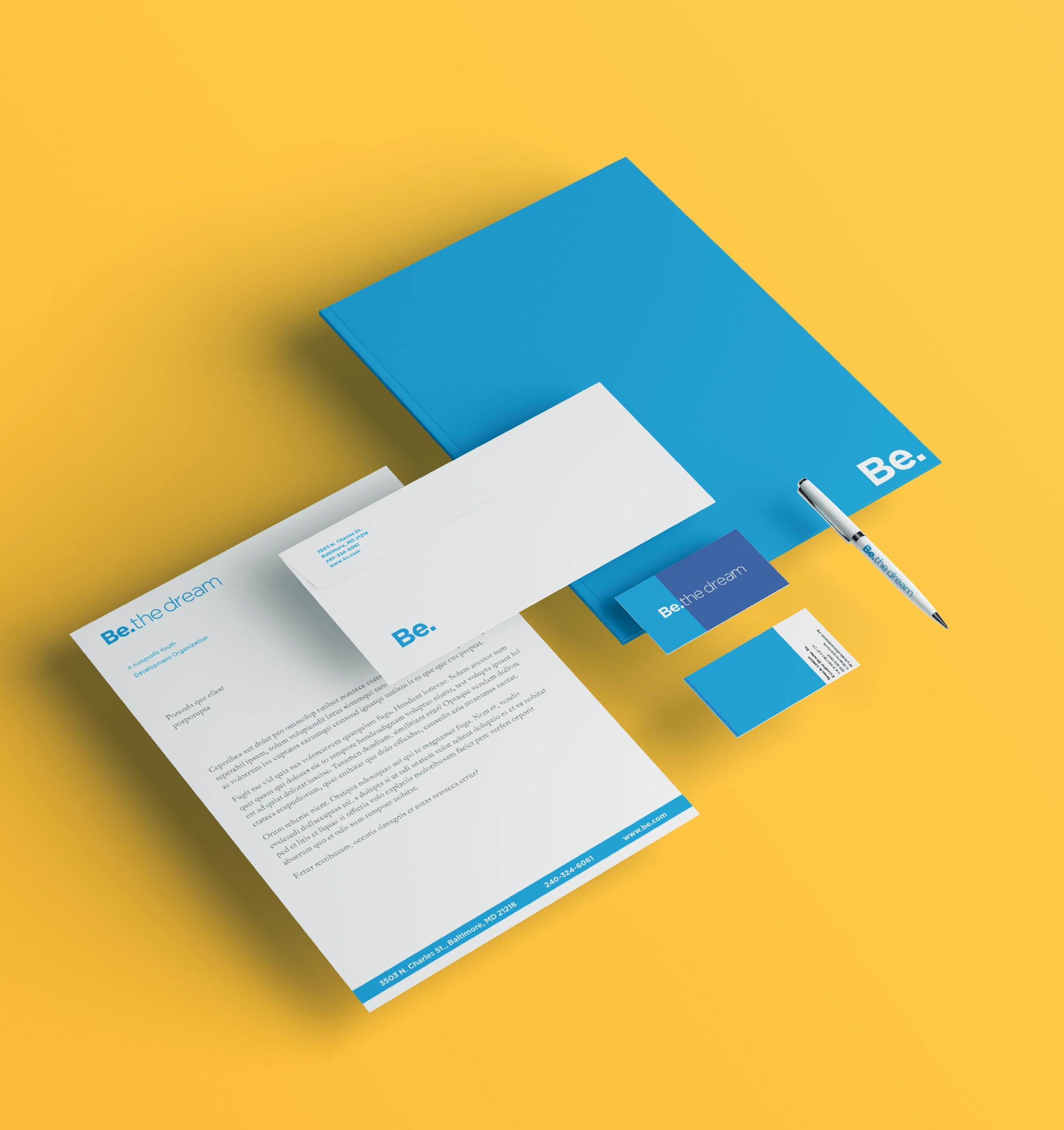


Colour
The primary colours needed a revamp. With research, I was able to create a set number of colours that mimicked the last primary and secondary colours that express the positive the Be. the organisation provides to its clients.


Web Design & Events
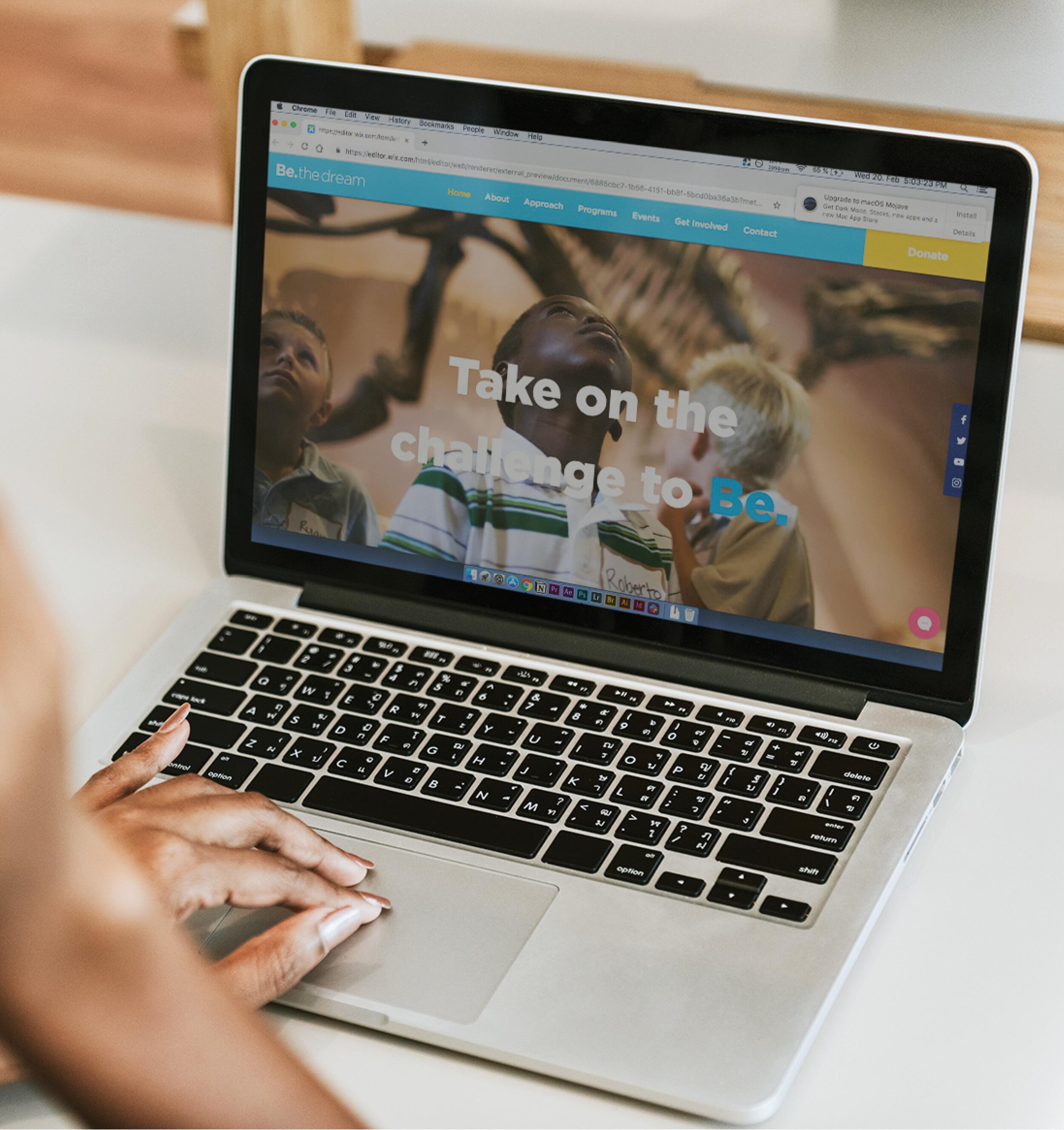
Recently, a fresh website was designed and created to allow users to access current information or donate to the organization, significantly improving user experience. During the website redesign, an invitation was received to their ‘Sneaker Ball’ event. The organization celebrated their 5th year anniversary and unveiled their new brand identity. It was fantastic being a part of their brand redesign journey.
Removing the clutter and simplifying the logomark made the form recognizable to their current customers. The tagline was adjusted to encourage a stronger ‘call to action’ towards new customers and donors.age stronger engagement from new customers and donors.